The UI should have a pervasive theme throughout, from typography to navigation to user controls, that adds to the game narrative…
I could not think of any conceivable way to use my client’s assets to make a video game, so I wanted to take this opportunity to branch out.
Lately, I’ve been playing a lot of a tower defense game called Arknights (this link shows what a level in Arknights looks like), so I decided to make a tower defense UI mockup.
Originally, the grid was going to be used for a party game like Mario Party.
For the aesthetic, I imagined a game devoid of color and creativity/freehand elements except for the enemies (clearly drawn by hand) and the player’s deployable units (clearly drawn by hand and the only splashes of color on the screen other than UI elements).
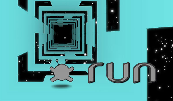
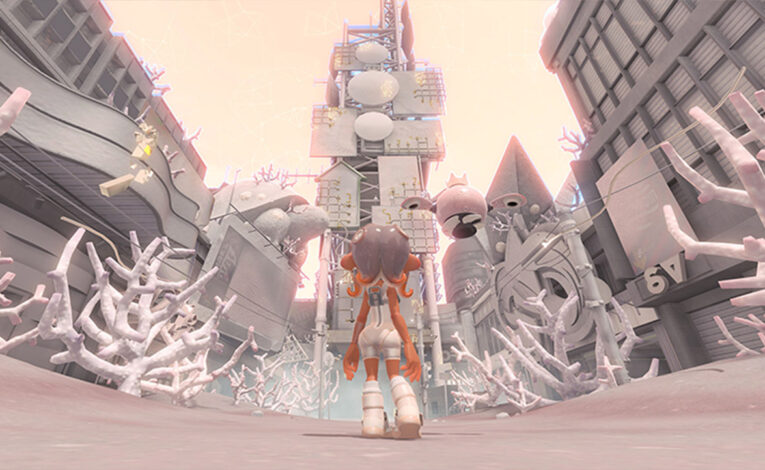
This is inspired by games like Run, which were popular when I was little, as well as Splatoon 3: Side Order (image 1 | image 2).
 The title screen shows that contrast between a rigid, cold UI and colorful elements that look like a child wrote them (to symbolize creativity and freedom). The third option is something that the player has not unlocked yet. Perhaps it would be a cutscene replay menu.

The level would presumably be the tutorial level. It contains the following:
- A green box with a heart, which is the objective point to defend. This idea is borrowed from Arknights (but the box is blue with a hazard sign in that game).
- A red box with an X, which is where enemies come from. This is also a borrowed idea, but the original box had a hazard sign.
- A pause button in the top right.
- The number of life points remaining (3), the number of defeated enemies (0), and the total number of enemies that will appear in the level (12).
- Solid gray tiles, which the player can place units on.
- Gray tiles with black dots, which are off-limits.
- Two enemies running at the bottom.
- An offense unit and a defense unit already placed on the map by the player. One has a partially charged skill bar (allowing them to use a special ability when full), and the other’s is full and glowing.
- On the bottom, remaining units are shown. There are 2 more swordsmen that can be deployed, there are 0 shield defenders (all are on the map already), and the other types have 1 unit available. Some slots are unfilled (denoted by Xs).
In this mockup, red denotes offense units. Blue is defense, green is healing, and purple charges other units’ skills faster. The pause button is also blue because pausing gives the player time to think; pausing defends them from the real-time onslaught of enemies.
The people on the map would have idle/attack/moving animation loops if this was a real game, and their heads would be redrawn for each frame to further develop the idea that these are meant to look hand-drawn. In a world of rigidity, they are what give it flexibility and life.
As usual, all assets were made by me using a variety of software.