Personas
A persona is a visualization of the demographic info of the end-user(s) of a software application. A persona blends demographic information about an example inidividual with qualitative information, such as a backstory, preferences, and motivations. A user-centered design approach leverages this information to develop specifications for the software prototype, such as the feature list, the “look and feel”, etc.
Information to consider includes:
Age range: 18-27
General educational level: Bachelor or master degree
Computer/technology literacy: familiarity with technology
Technology access (own computer? network connection? broadband?): own computer
Occupation: student
Environment (work, school, library…): campus
Socioeconomic group: student, youth
Gender, Race, or Ethnic group if applicable: Chinese
Language (specific terminology as well): Chinese(Mandarin or Cantonese
Special needs (disabilities):None
Cultural preferences: Chinese culture
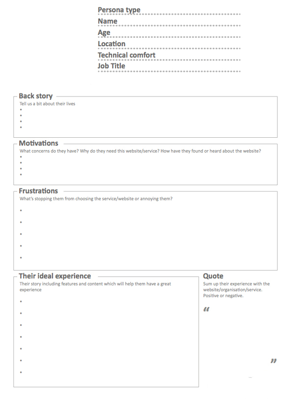
Gathering this information can take several forms – interviews, surveys, and site visits. Clients may have collected data on their constituents as well. When the data is collected it’s typically presented in a kind of a table. The template below is a pretty standard example:
https://www3.cs.stonybrook.edu/~tony/ui/personatemplate.jpg
Color Palette
A color palette is a selection of complimentary colors associated with various elements of the UI program, such as background color, headlines, body copy, icons and buttons, etc. Usually 4 – 8 colors are selected from the web-safe 216 palette. Clarity and legibility are the main objectives, but contributing to the “mood” of the application is also important. A good resource to develop a color palette is https://color.adobe.com/
You can use the “Extract Theme” feature to create a palette based on a photo, such as a picture of your client’s product(s) or their storefront. Or you can create a custom palette of your own using the color wheel. If you create an account you will be able to save your palettes to an online library, or you can just download them as a jpeg file (or CSS).
When you have created your color palette, download it as a jpeg file and add it to your “Design Brief” page on your project web site (below the Persona section). Email the URL to uidev@cs.stonybrook.edu with “Palette” in the subject line.

Moodboard

CSE 333 Wireflow Assignment
Wireframes are not primarily intended to show the “look and feel” of the user interface, but to determine the scale and placement of various elements, such as text, navigation, content, controls, etc. Typically several screens are drafted, such as the start screen, main menu, game level, shopping cart, etc. You can build these wireframes in Lucidchart, a plug-in for Google docs.
You can get Lucidchart by going to your Stony Brook email account and selecting the grid icon in the upper right (where you access Google Drive). Scroll down to the bottom of the apps palette and choose “More from Apps Marketplace”. Search for Lucidchart, install it into your suite of Google apps, and launch it.
You can start with a blank document, or you can edit a template. After you launch Lucidchart, select “More Templates” from the menu bar. There you will see categories of Wireframe, Android, and iOS. Depending on the scope of your project, you may need wireframes for more than one platform (such as desktop and mobile). If you need additional widgets for your mockup, you can select the “+ Shapes” button at the bottom of the widget palette, and you can even import images or .svg files (such as a logo) from the Insert menu.
For this assignment you should wireframe at least four main screens of your app or web site (not login or language choice dialogs). Another approach is to do a “wireflow”, which is a cross between a flow line diagram of the app’s functionality and wireframes of each screen. A good template for wireflows in Lucidchart can be found in the Wireframes template category. Wireflows help to visualize not only screen layout but the connections between screens in the app.
Make sure your Lucidchart document fits the view by choosing View > Zoom to Content. When you are done, you can publish your wireframes of wireflow by choosing Share > Publish. Choose Single page (PDF/Image) from the drop-down menu in the resulting dialog, and choose PNG for the file format and Screen Zoom (view) for the resolution. Upload the .png file(s) to your project documentation.
You should mock up one of those main screens in Photoshop, GIMP, Illustrator or Inkscape (or even Luicdchart using the iOS or Android templates) to show a draft of the look and feel of the finished interface, including the color palette, typography, and graphics (such as logo and icons). Upload that .png file to your documentation as well. When you are done, email the URL of the wireframes and mockup to uidev@cs.stonybrook.edu with “Wireframe” in the subject line. The wireflow and mock-up should be added to the Design Brief section of your web site (along with the Persona and Color Palette).
You could also use Figma to develop your mock-up. You can download the Figma desktop app (free and cross-platform) from https://www.figma.com/downloads/. You can share the link with uidev@cs.stonybrook.edu with “Wireframe” in the invite message. Just click the Share button in the upper right corner of the Figma workspace. You should copy the link to your documentation and include a screen shot.
Here is a good page that discusses the importance of wire framing and provides some examples.
https://creately.com/blog/diagrams/wire-frame-benefits/
This page is a comprehensive tutorial for wire framing a web site.
https://webdesign.tutsplus.com/articles/a-beginners-guide-to-wireframing–webdesign-7399
Rubric
1. Followed the instructions:
• Wireframes or a wireflow, and a mockup were uploaded as specified above, and a link to the files was emailed to uidev@cs.stonybrook.edu.
2. Met the design criteria:
• At least 4 major screens were laid out.
• Wireframe screen layouts prioritize content, and minimize text density.
• Wireframe navigation is easy to find, but not redundant.
• White space is used effectively.
• Screen elements are appropriately labeled or annotated to reduce ambiguity about their function.
• Consistency of placement of elements, like navigation buttons or icons, from screen to screen.
• Mockup leverages look and feel developed for UI elements (logo, typography, icons, color scheme)
• Mockup has overall aesthetic appeal.
• Good technical execution (crisp edges, clean shapes, legible typography)
That’s 10 criteria, or approximately 1 point each.