Hi all … I wanted to point you to the TV series that I worked on for over a year while at PSU with Dr. Sam Richards, an interactive TV show based on his incredibly popular and challenging Race Relations sociology course. You guys got to meet Sam “in class” when he did his virtual drop in … this is the exact show I was talking about. After close to three years the vision is coming true with an online screening tonight. I urge you to watch and think along with the program. I’d love to hear follow up comments from those who tune in. Watch through the lenses of community, identity, and design. Here is a preview …
Disruptive Technologies
Course site for Disruptive Technologies. Exploring identity, community, & design.
Category: Design (page 2 of 3)
I created this slate document to provide my response to how I define design. I included some simple ideas I had about qualities usually investigated in the design process along with examples of how my illustrations utilize design.
This is going to be tricky, because I wouldn’t be surprised if something similar already exists.
I would like an app that would show me a map of all campus activities going on per day. I.e. when I would open the app, I would see a map with push pins, i.e. one at the stadium representing a soccer game at 6pm today, and that at Staller there will be a play at 8pm.
I would also like it to have different color pins, i.e. green representing events today, blue representing events tomorrow, yellow representing events in the upcoming week.
The app would also provide alerts when you are near an event. I.e. Soccer game 100ft ahead in 1 hour.
My personal definition: Design is the engineering of a product or service that best addresses a need.
If I had to define design with one world, I would have to say “Apple”.
Apple certainly understands the importance of design in their products. Their visually appealing devices are not necessarily superior to others, but their design appeal has catapult them into one of the most innovative companies nowadays, with earning in the billions.

As an undergraduate I enjoyed studying both art and science. When I look back on what could be added to the iPad that could have enriched my experience I have a few ideas. Two of them center around studying art at a university that is focused on science.
The first would be an app that puts researchers and students/artists in touch with each other allowing students more opportunities to see what is going on in the community as well as correspond and get feedback from researchers and have a greater exchange of ideas. Something that is like a hybrid of yammer, LinkedIn, and possibly something else entirely.
My second and more developed idea is an app called “critiQue”. I recently had the opportunity to participate as a reviewer in an art show for students about ready to graduate high school and enter college most likely to pursue arts. For many of them it was the first time someone other than their teacher, friends, and family had given them feedback. This made me reflect on my experiences and what could be done to help students broaden their ability to receive crucial feedback. One thing I would have like to see would be a social media app that allows others to critique your work and provide you with constructive criticism. Though the critiquing process is sometimes harsh there is no better way to develop your work than by hearing criticism from others. For students especially those at a university like Stony Brook there would be many benefits to this type of app. Most apps are geared to social posting and comments are often from people outside the field who either “like” it or have some other generic “it’s pretty” comment that does not add any valuable discourse. While it is nice to hear people like your work, it does not help someone improve their work. Why is it good or bad? Why do you like it? How could I improve? These are all questions that are asked in isolated classrooms. Why not take this to the larger student artist community rather than waiting for the slim chance of an exhibition where you might have your work displayed and may get a few helpful comments ? It is very important to be able to see your work against the larger community discussion taking place in art across this campus as well as other campuses. In such an app, you could post your work in progress and hear feed back from other art students, faculty and professionals. Constructive comments could be rated to show which ones are most valuable and how many people agree. The initial amount of works you may share would be a small standard amount but would increase as you give feedback to others fostering a discussion between students.
When I think of [design] I imagine a process of exploring and experimenting with an open mind, guided by a specific purpose; problem solving and artistic expression intertwine to create a product that is useful and aesthetically pleasing.

Click on the image to see a brief “Slate Presentation” on the roles of 3D printing in the design process of wind instruments that I create.
With all of this newfangled technology that’s being offered to us as students in 2015, there sometimes seems to be a disconnect between what’s helpful or good to use and how quickly we can actually use it. It’s 2015 so there’s no reason to not immediately reply to a text (even at 4:36 am), no reason I should not immediately know an answer in class, no reason I shouldn’t have an immediate comeback to someone else’s wit, and no reason I should have to wait on a table at 7 pm on a Friday night at T.G.I. FRiDAY’S. You know I’m joking, but people often forget to take a moment to breathe and realize that not everything has to be so immediate–if you’re shooting for a comeback, that’s another story. Funny is as funny does after all.
One thing that can be sped up, however, is productivity on mobile devices. Mobile apps were created in part to make things faster for the consumer. For students in particular, Google Apps for Education has been a great addition to our productivity toolkits. The problem with using them on a mobile device is that they’re often limited versions of the actual programs. Another issue (even when on desktops), is that the user has to create a project in one program, save, export, and maybe be able to upload it into another program for further edits. I propose a Course Management Software not completely unlike Blackboard or Moodle, but one that is based on Google Apps for Education.
This app would have all the general functionality of another CMS, but is set apart by the affordances of Google. When a professor uploads a PDF of a reading, I would be able to open and annotate without saving it to my device and opening in another app. I would be able to record my lectures and tag them appropriately for followup. One of the best parts about a Google-based CMS is the data creation portion. Instead of having all the Google Apps as part of separate programs, they would all appear on one main screen as a “toolbar selector.” For instance, I begin a new document and type out what I want to say (Docs toolbar), then I want to add a nice visual so I click on the LucidCharts toolbar option and immediately my toolbox items change, but my document remains. When finished with the document, I would have the option of saving in a variety of formats (depending on what media I used to create my project).
As a student that has been using an iPad for a few months now, I feel that I can adequately navigate through iOS quickly and efficiently. That being said, I often am just waiting on my apps to swap over (or to figure out how to export and reopen elsewhere). With a fully integrated app, I can probably save an entire 2 minutes a day. It may not seem like much, but over four years of education that’s almost 11 hours of time that can be spent elsewhere–quite possibly used to make even better work.
DO NOT PRESS
DO NOT PRESS
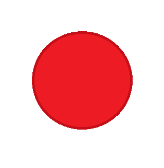
We’ve probably all seen something similar to this online. The infamous Big Red Button that we are not allowed to press. I think that it is a great example of design. Why, you say? I’ll tell you. What is the first thing that you want to do when you see it? Press it! This object, is not only recognizable, but it implores you to use it without overtly saying to do so. You think that it is of your own will that you’re pressing the button–in fact, it must be your own choosing because the button said don’t press it.
For those visually inclined peeps, the contrast of smooth-edged red, and seemingly rough-edged white balance each other out. If you’re still not sure if this design is up to par in terms of artistic content because I made it in Microsoft Paint, I know of a great nation on the other side of the world that might help you decide.
Let me know what you choose. In the meantime, I’ve got a button to go press.
Technically Yours,
R.
What do you think we should do to make the log in page for Blackboard at Stony Brook more useful and pleasing?

This week I will once again hand the course over to our two teams. I am very much looking forward to seeing what you have in store for us all today. The vast majority of the class today will center on the two teams leading the conversation. We will see if there is time remaining to introduce the next (and final) block of he class focusing on design.
For the final block we will be focusing on Human Centered Design and will follow the process that the unbelievably good firm, Ideo articulates. I would like you all to get accounts at their Design Kit site, download it, and read the Introduction and the Hear portion for next week. That will allow us to hit the ground running.
Out of Class
- Weekly Create — Show us what you think design means by being creative. Write your personal definition of design in your post.
- Weekly iPad Reflection — what iPad app is missing for you students in higher education? I want you to be as creative in your thinking as possible and use what you feel you understand about the work flow of students on college campuses. If you could build anything, what would it be and what would it enable?
- Read “An Introduction to Design Thinking“
- Read “Designing the New Twitter Profiles“
- Go to the Read Kit site and watch the “What is Human Centered Design” video
- Create an account
- Download and read the Design Kit Pages 1-18
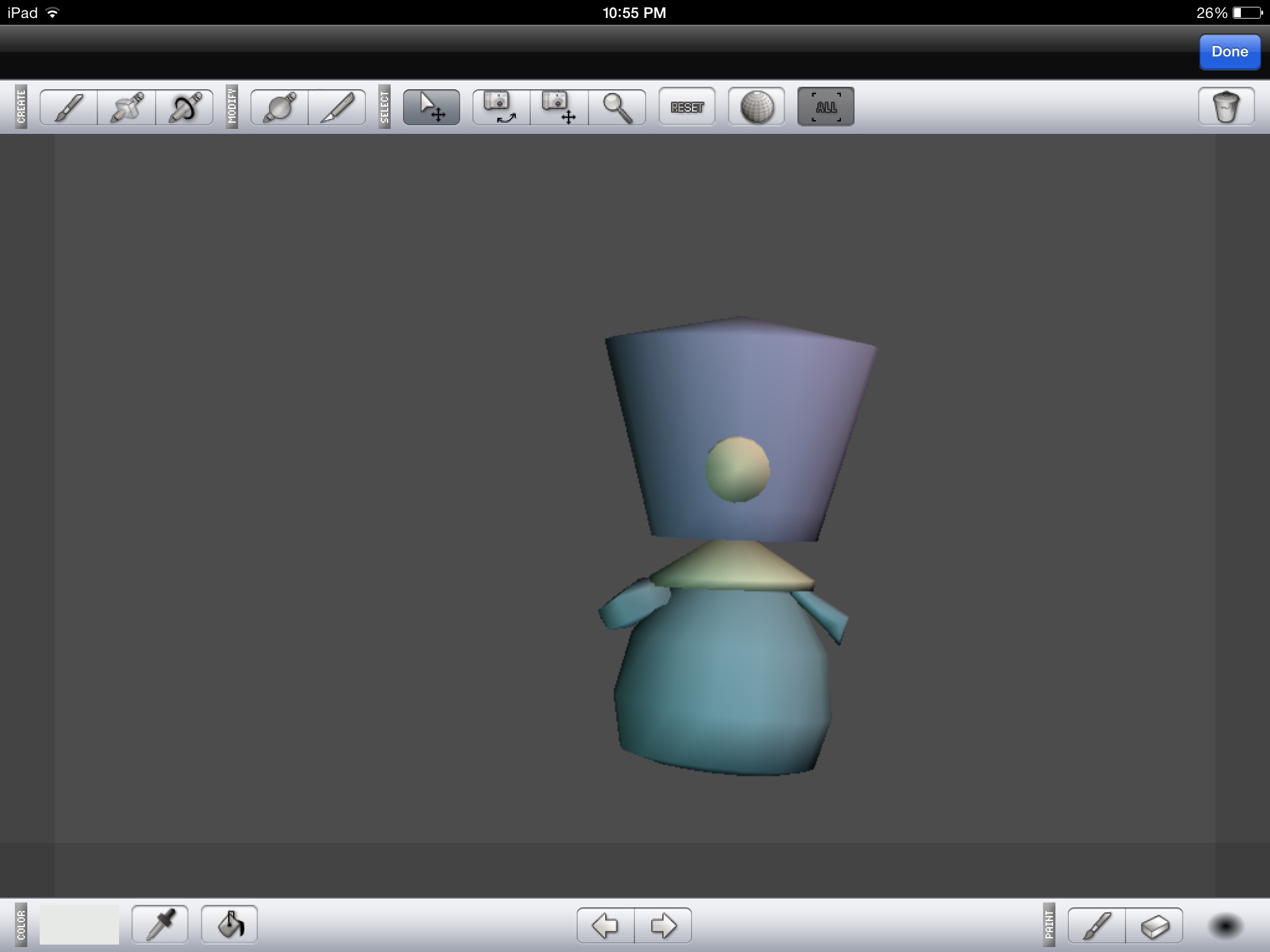
I decided to try it a 3D modeling software on my iPad called Sunny 3D. The interface is very minimalistic so it seems very easy. Actually creating shapes is a different matter. I think my model came out pretty good considering I’m a novice.
We chose YouTube as our disruptive medium. Since YouTube was created 10 years ago, 300 hours of video are uploaded to the site every minute. (source).
YouTube disrupts traditional television stations and contributes to “cord-cutting” by providing an alternative source of content, one where anyone can produce as well as consume. It can even deliver a replacement for the “10 foot experience” using YouTube Leanback, which allows videos to be viewed on a TV and controlled using a smartphone.
For the weekly create, I’d like to post a video I recently created with the help of native software in my Macbook Air. I was able to edit the video, add music, effects, etc. It’s incredible how, with the help of these free tools, you can create professional grade documentaries.
The video is of my daughter and I going shark diving for her 12th birthday:
I do watch a lot of sports, but I do not typically rely on any specific app for my sports news per se. I like the Yahoo Sports app for the iPhone/iPad because of its speed, but ESPN is more my style editorially. I don’t really use their apps all that much becuase I have histroically found them underwhelming. Apparentally that is about to change. This is really a great read about the changes coming and the design decisions ESPN made along the way.
Subscribe by Email
This form is protected by reCAPTCHA and the Google Privacy Policy and Terms of Service apply.

© 2024 Disruptive Technologies
Theme by Anders Noren — Up ↑
Recent Comments