Typography
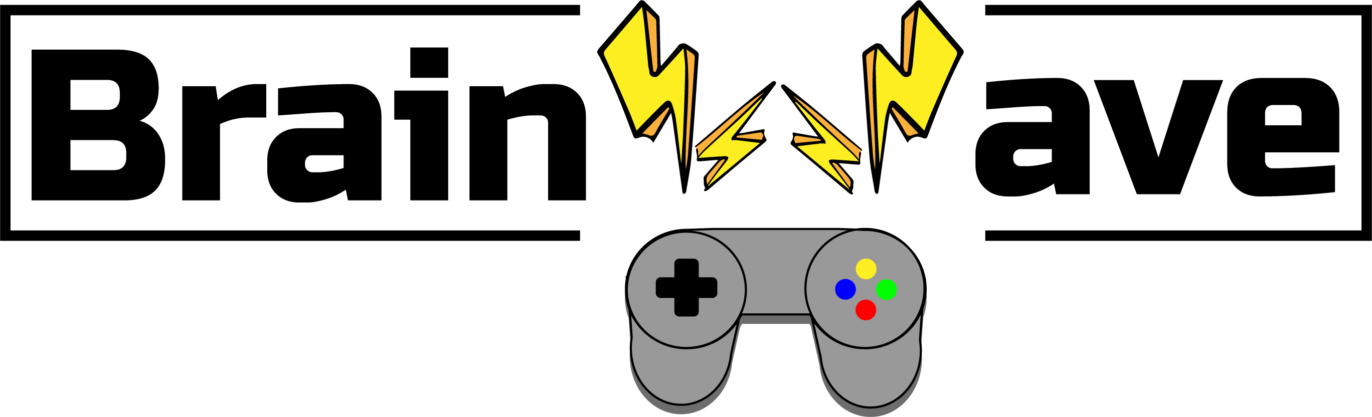
BrainWave Studios Colored Logotype
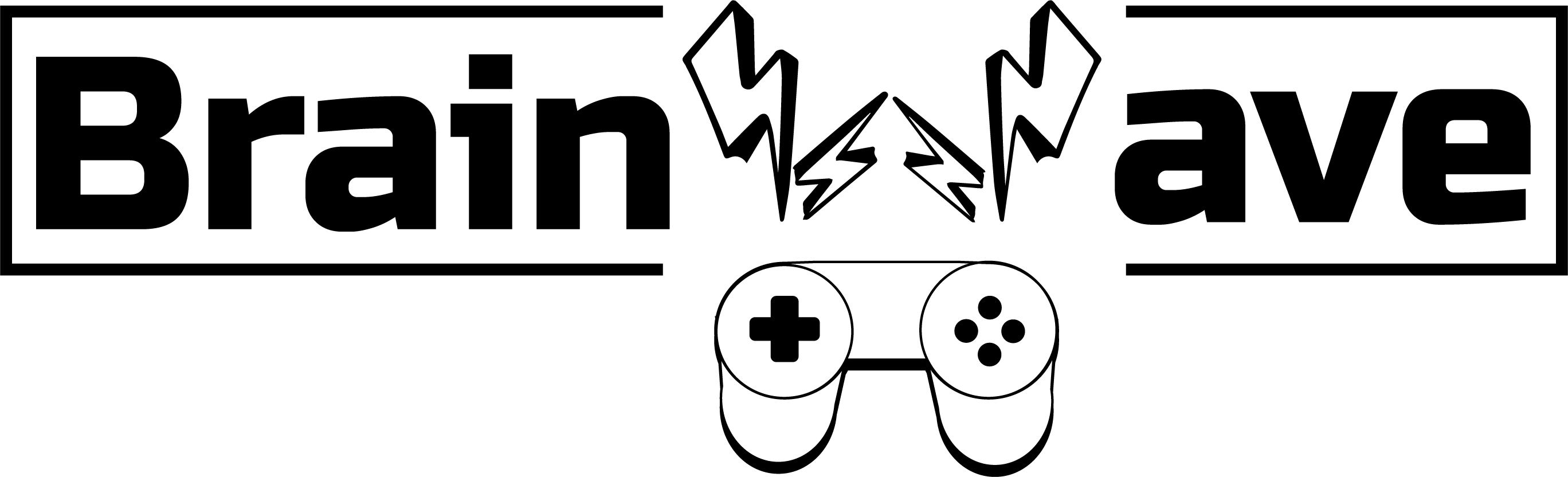
BrainWave Studios Black and White Logotype
Design explanation
The audience this logotype is aimed at are gamers. The controller in the middle is supposed to give a clear message that this is a company that makes games. I made the W in Brainwave into lightning bolts since brain waves are pulses of electricity and it was good way to integrate more visuals into the name itself. I chose Russo One as the font because it is bold and eye-catching while still being a little rounded which goes with the rest of the design. Bahnschrift would make a good complementary font since it is a little thinner than Russo and maintains the square ends. It can be used in bold for subheadings and regular for body text.