Stony Brook Game Developers Club Typography
Stony Brook Game Developers Club Typography (Black & White)

Description
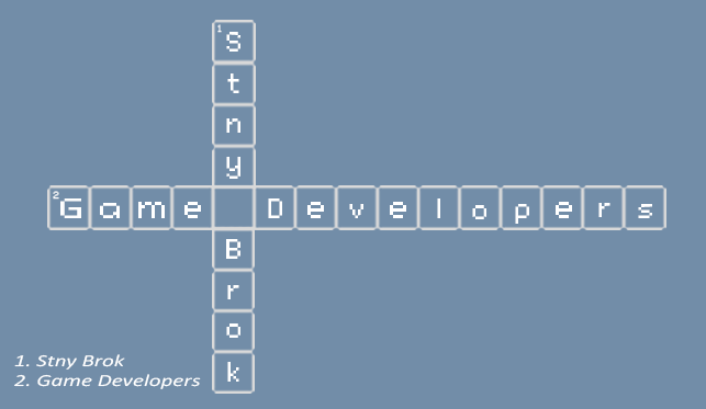
For my typography, I made an alternative logo for my club, the Stony Brook Game Developers. The colors I used were a muted blue and white to give the ideas of clearness, smoothness and wisdom because those concepts are required to make a good game and because practice with programming and learning game design brings wisdom. I also chose blue because it’s evocative of a clear, blue sky that isn’t too bright to give a feeling of realism and humbleness. I also chose blue because it is one of the colors used for the logo of the club. I chose to make the typography using crossword puzzles as an influence to shape it like a sword to give a sense of heroism and to evoke games in how swords are a typical weapon in games. I also shortened Stony Brook to better evoke the sword motif. I used a crossword puzzle influence because crossword puzzles are a very basic form of game and were made before video games were created. For the font, I used a video game-esque font to evoke programming and a basic feeling to game design. The font choice I used were connection and calibri. I used connection as a bit-like font to evoke video games, especially old fashioned retro games and I chose an italicized calibri to make the words that are entered into the crossword puzzle look like user commands in a module. The intended audience would be people who have never heard of the club before. The minimalist and game-esque design will appeal to them and give the a good idea of what the club is.