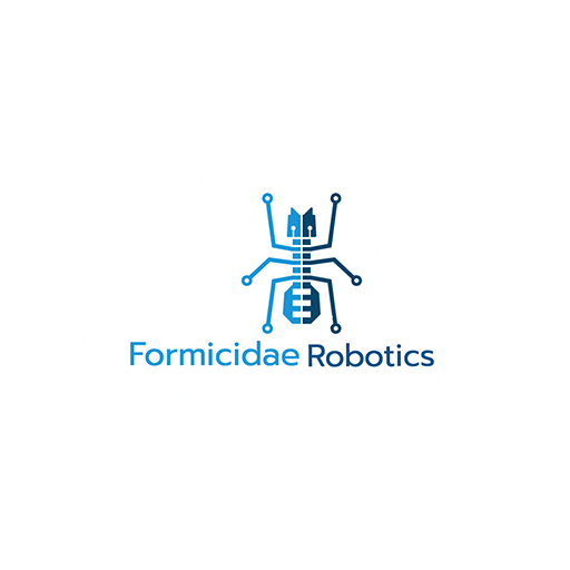

Before I started designing a logo, I first thought about what is my interest and values. I determined that I have an interest in electronics. I decided to design my logo around this interest along with my values. I would want my company to be more than innovative. The company would value strength in numbers meaning teamwork. To collaboratively work together efficiently to make solutions for our world. To do so, we would value the diversity of ideas from our team which allows us to understand the needs of people from different perspectives and experiences.
Taking this into consideration, I thought of how an ant possesses all of these values and decided to use the image of an ant as our logo. The logo was carefully made where each feature on the logo represents an important characteristic of the company. The bars seen going vertical doing the ant represents a spine. This signifies that ant’s characteristics as described above are the backbone of our company. the legs attached to the ant has little circles at their ending. This is easily recognizable to represent electronics. Now we notice two different colors on the ant and the company’s name. The light blue (left) side corresponds with the color in Formicidae while the dark blue (right) corresponds to the color in Robotics. What this means is that the left side of the ant possesses the characteristics of an ant as well our values while the right side represents innovation and technology. However, the backbone holds both sides together. Without one of the sides, the company would not exist or be unique from other tech companies. Now for the naming of the company, some might question as to why I used the word Formicidae and not. The reasoning for this is because I simply did not like how the name “Ant Robotics” appeared. The word Ant is small in letters compared to Robotics which bothers me as there seems to be an inequality of balance between both sides. Formicidae is another word for Ant and I found it to be more unique sounding than ant. When we look at “Formicidae Robotics”, while both words do not have the same amount of letters, we can almost see that there is a balance on how we perceive it which is more satisfying to the eye.