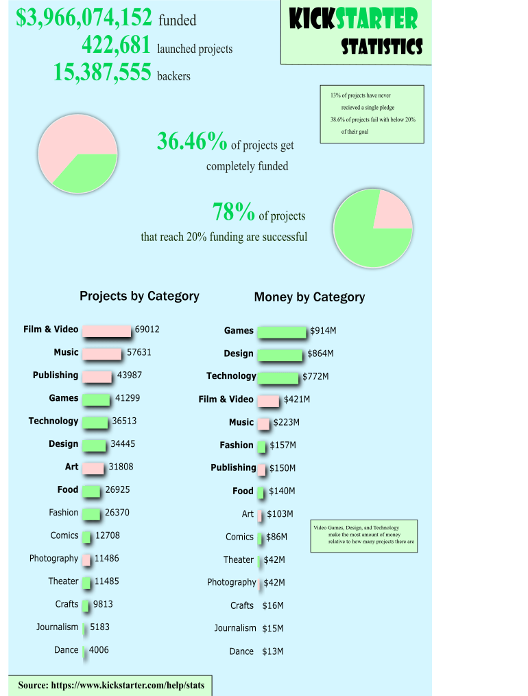
I chose to do a Kickstarter infographic because it related to another class I’m currently taking where I also had to select a data set. I wanted to have my text be in the same color scheme as the Kickstarter logo, which was black and green, but having a green background with green text doesn’t work so well, so I decided to go with blue which is easy to look at, and is close to green. I separated the information into 3 parts, based on what I think people would be interested in when they first look at. First, the upper half of the info graphic is the most basic information, with the numbers highlighted and bolded. Next is also basic information, but with a pie chart added for people who also want to glance, since it’s slightly more complex than a number, and also to give weight to the upper half of the infographic compared to the bar graphs. For the second part in the bottom half, there’s information about each category’s funding and projects. I colored those that made more money per project with green, and red for those that made less, and bolded the top categories for each. Finally, for I made some sidenotes within a green border, for those that wanted to read more without looking at the source, and made the font small enough that you could glance over and ignore it. Most of these were placed on the right side, to balance the bar graphs being left centered.