THE FINAL PROJECT: Fitting the pieces together

I got my photographs the day after I sent them to Walgreens online.

Once I was able to find time to work on the final project, I took my photographs and sorted them out into different categories. The different categories range from the head, to the sides and the arms.

My process for creating this project involved taping the photographs together from the back and arranging them on the mannequin. The photo below shows an example of that process.

The reason why I chose to tape from the back of the photographs rather than the front is because I have learned from my first project of this course that the tape can be distracting to the viewer. So I made my effort to show as little tape as possible. I believe there are a few pieces of tape that are visible from gaps, but I feel that it is less distracting than if every piece of tape was seen on the figure. As I was going through the process of arranging the photographs on the mannequin I made a few tweaks to my project. One of those change involves the hands of the mannequin. I will not be  presenting the project with the hands because I wasn’t able to completely cover the hands with the photographs I have.

As I started with the head, I noticed that the head was bigger than expected. So I had to improvise and eventually used a few cup holders to increase the height of the head.

I knew the hardest part would be assembling the head because I figured that it would be difficult to bend photographs into a spherical shape. It was hard because I was taping the photographs from the back and was trying to make them stay. The head doesn’t look perfect, but it gets the idea across.

When I got to the torso of the figure, it became a little bit easier to arrange the photographs. One task that I did that made it easy was that I placed the front and back torso in the way that it should look on the mannequin.

During the process of adding photographs on the piece, I cut off the background so that the focus would only be on the actual figure. If I were to create this in a two dimensional setting, I would use the background to make one picture. My figure is three dimensional so the background is not necessary. While I was working on this project, I realized that I took to many pictures. I have 122 pictures in total but some had to be discarded because of the size that I had to work with.

I finished applying the photographs this morning and so far, it looks good. There are some aspects that could use some improvement, but overall, I am happy with how it turned out.

THE FINAL PROJECT: The Editing Week

This week  I was able to edit the photographs that I took of my sister. There were a ton of pictures to look over. I had 121 pictures to edit on Lightroom. What I did was, I made the pictures that will be in the front lighter and the pictures that will be in the back a little dark. This will both help me figure out which pictures will go where and help create an interesting lighting effect on my project. After I edited the pictures, I put them on my flash drive and put them on the Walgreen’s website today. Now I just need to pick up the photographs when they are ready and put them on the Mannequin. That is my progress so far and I will show the final product when it is ready.

THE FINAL PROJECT: The Photoshoot

Today I was figuring out how to make the structure for the head. I was originally going to use a paper towel roll as a center for the head, but then I ended up using a piece of foam. I was going to get a ball of Styrofoam, but then I saw that Michael’s sold these heads made of Styrofoam. So I purchased that and shortened the neck so that it would fit on the mannequin.

When I bring my project in, I will be using a stool instead of a box to make the mannequin tall enough. The stool was chosen so that it wouldn’t be obvious that there weren’t legs underneath.

Here’s a picture of how the mannequin looks right now. If the skirt looks a little too high, it’s because I plan to have the photographs hang down covering the top of the skirt.

I was also able to take the pictures of my sister today. It was a challenge to try to get the best possible angle, but it worked out.
That is my progress so far. This week I plan to edit my photographs during lab time to make the images look slightly better.

THE FINAL PROJECT: The Starting Point

Last night (11/28/17), I brought home a mannequin for my final project. HUGE thanks goes to Professor Jasna Boudard for letting me borrow her mannequin.

I wanted to acquire the mannequin first so I would have a better understanding of how I could orient my pictures on it. I plan to use photographs of my sister for this project. Those photographs will be taped together from the back and put on to the mannequin almost like a suit. I will need to make a structure for the head to rest on for the top of the piece. I also plan to have the mannequin wear the bottom part of a gown to make it seem as if this piece is an actual person. To give that effect, I will have the mannequin stand on boxes to be at human height. Here is a sketch to visualize my idea for this piece. I also have my original plan for this project just to show my progress from my original proposal.

My sister agreed to this project and I plan to photograph her next week. After that, I will use the remaining lab time during the last week of classes to edit them. Once I edit the photographs, I will print them as soon as possible using either CVS or Walgreens to print them. When the photographs are printed, I will place them around the mannequin and adjust it to how I want. That is my plan to approach this final project.

Project 3: The Rage of the Storm

I decided to name this work “The Rage of the Storm” because of the tornado in the center. That tornado was taken from the internet from what I believe is from Wikipedia. The other images were taken by me and manipulated in a way that it would appear that a tornado is rampaging through the street.

The top picture is of my house and the bottom picture is from my grandma’s house. The reason why I chose two houses was because I wanted to use the concept of merging both pictures to make a bigger setting.

These two images were chosen to lay on the ground because the idea is that the tornado had already picked those items up and carried them.

This image was broken apart into two different trees. It was a challenge to make them work in the my picture because it was time consuming to get rid of the blue sky that was peeking through the trees. I was originally going to use four trees in this picture but I ended up using three because the image became so cluttered, it was hard to determine the focal point. The focal point is meant to be the tornado.

The images above are parts of the things that you will find in the tornado’s wrath. I wanted specific things to be in the tornado such as the telephone pole and the car because it was meant to capture an intense experience.

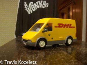
This is the final image that I used in this piece. You might be wondering “Why am I using a toy truck for a Photoshop project?” Well, I chose this item because I wanted to play around with scale in this image and this truck looked realistic to me. So I made sure that the truck was just about the right size by the tornado. I also darkened the front window so that you couldn’t see the figure in the truck.

The Mask: Photoshop

The image above was made by using different masking tools. One noticeable mask is the back and white one. There are some areas that have color but the rest of the picture is black and white. The other mask that was used is the hiding mask tool. The lamp, camera top and the McDonalds cup on the table in the left were brought in from the pictures posted below. They were also scaled to fit in the space that I wanted them to.

The Second Project: The How, Where and Who

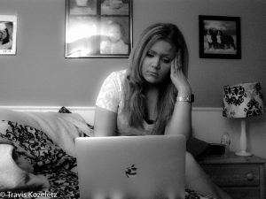
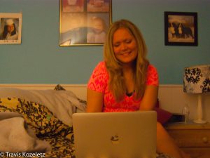
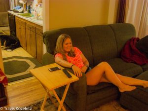
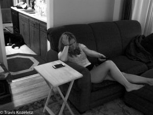
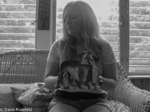
For the black and white project, I thought it would be an interesting idea if emotion would determine the black and white and color pictures. The idea for this project was that the black and white photos would represent stress and/or depression while the color photos would represent joy. My sister, Rachel agreed to be the subject for my photos.

These first few photos were taken in Rachel’s room.

These photos were shot in our living room.

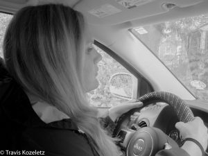
This scene was shot in Rachel’s car. I was very limited to how I was able to get this shot. That is because again, it was raining while I was photographing these scenes so I couldn’t be outside to shoot the photograph. This was shot in the front seat of the car because I figured that angle would be the best view possible to see her face whether she was stressed or happy.

The Second Photoshop Experiment

Here is an experiment of more tools that I learned from Photoshop.

In this photo, I made the dresser look like it couldn’t be opened, even though it has handles. I used the blur tool to blur the pens and pencils in the holder. I also used the blur tool on the side of the shelf for an interesting effect. The picture also has a yellow tone from a yellow overlay that I crested with a gradient. You may also notice a little globe in the trash can. This globe that was on my pencil sharpener on my desk, was placed there with the help of the patch tool and the clone stamp. The random work of art on the dresser was created by using both the paint and the paint history brush. This picture also utilizes the exposure tool to lighten the shadow of the chair.

An orange overlay is used in this picture except for the gray corner which was erased after I used the overlay tool. There also used to be a flag in the bottom right of the picture but I used the clone stamp tool to remove it. I used the blur tool on the Coca-Cola bottle cap to see if it would smooth it out. The exposure tools were used in this picture to try to even out the red wall.

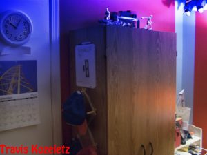
The dresser is presented as if it can’t be opened even though there are handles to open the dresser. You may also notice that there are no hinges on the closet door. I used the clone stamp tool to erase the hinge on the door. I also used the exposure tool to lighten the shadow that was cast by the dresser. The clock on the closet was sharpened with the sharpen tool just so I could see what would happen. The blue haze was done by using the gradient tool and then selecting the overlay option on the color blender option to blend the color with the picture.

Photoshop Experiment

In these images, I was playing around with the color elements of photoshop. I was testing different overlays and how they worked.

This image is about both the saturation on the dresser, and the purple box which was meant to resemble a photograph from the 70s. You may also notice a yellow haze in the picture.

This image brought the idea of sinking a text into a color. The text says Coca-Cola and it appears to be sinking in green slime. I also noticed how sometimes with the overlays, the color that was selected in that layer changes.

This last image plays with the idea of saturation. The main focus of this picture is the shadow that is cast by the dresser. You may notice that the shadow of the dresser is black and white. There is also a blend of the color red at the bottom right of the image.

Skip to toolbar